Architectural Visualization: A View to a Thrill
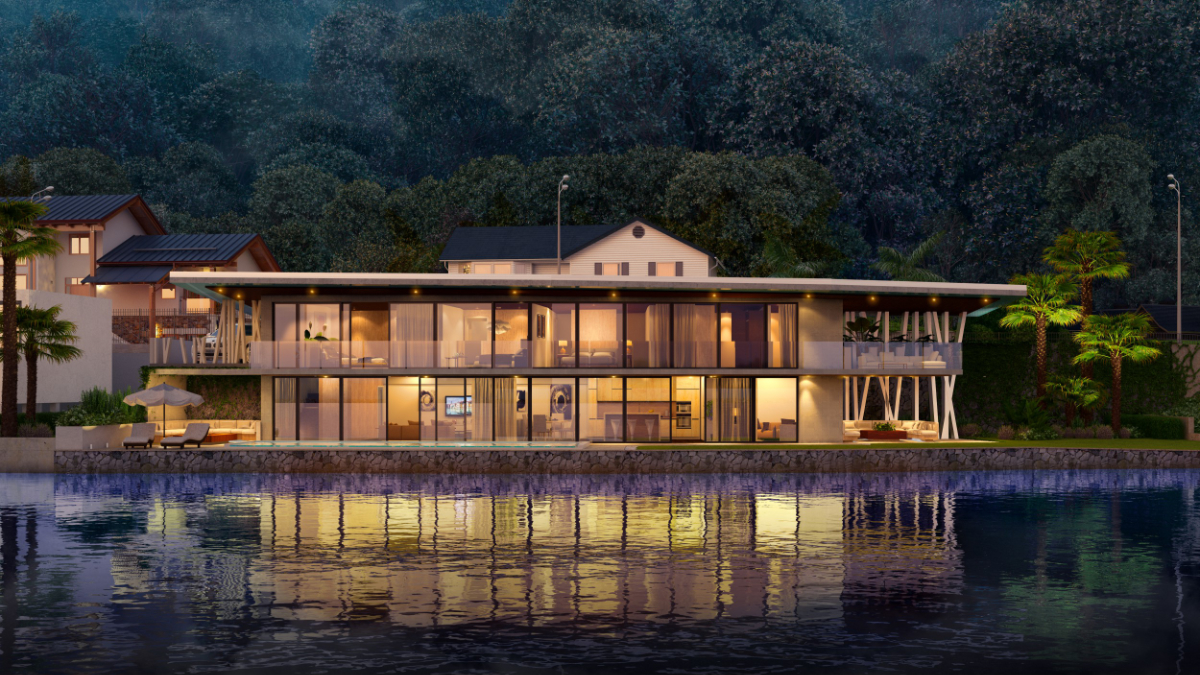
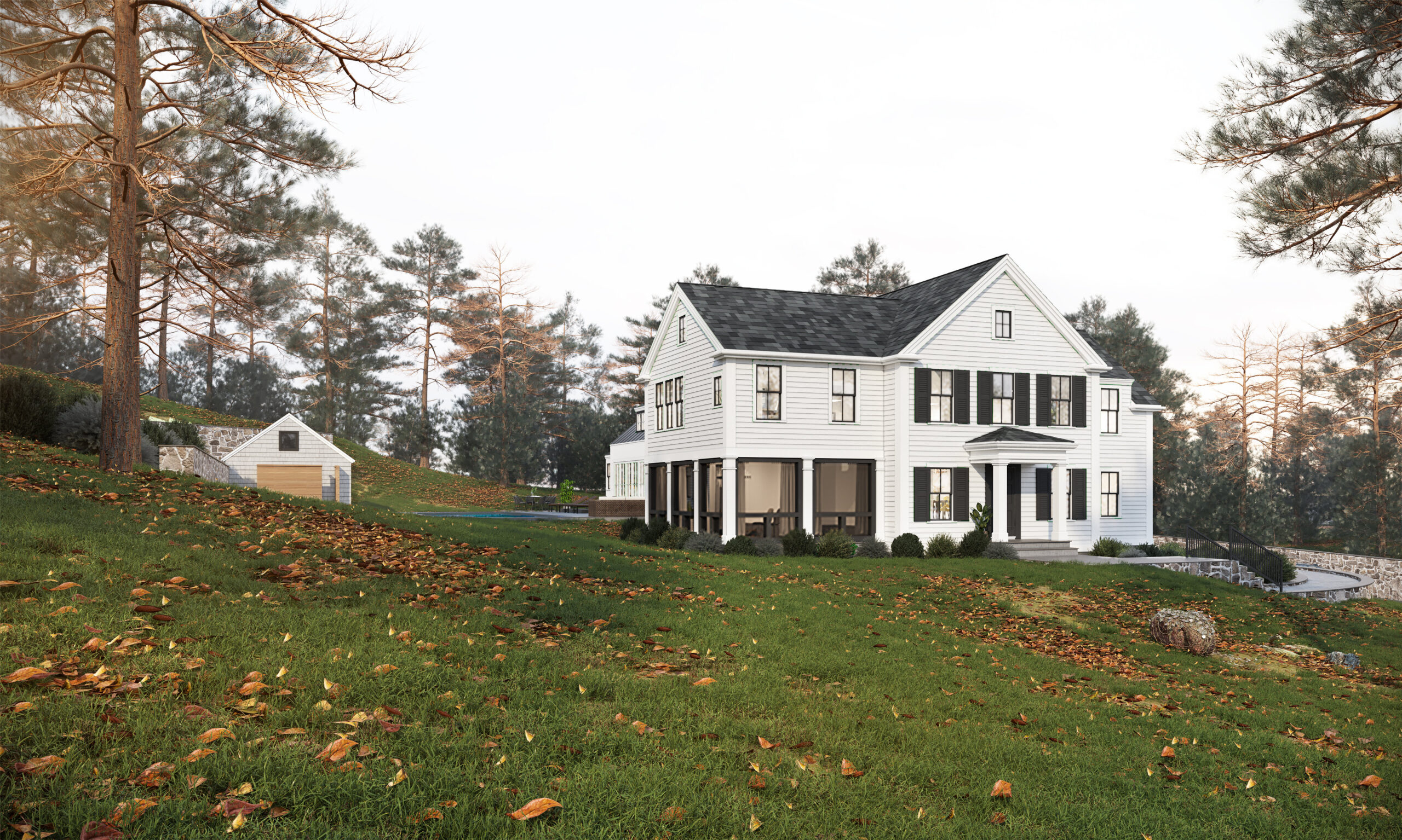
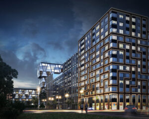 Recent innovations in 3D rendering as well as modern animation techniques have helped architects, builders, engineers and developers create a clearpicture of what a house or building could look like even before they are even built. An appreciation of the final outcome is the key in getting your clients to agree to the project. This challenging and daunting task can now be best realized with Architectural Visualization.
The process of Architectural Visualization looks into creating a detailed perspective of a project. Advances in computer graphics and digital rendering can now provide an almost mirror-image representation of a building or a house. Clients often times express difficulty in visualizing the many angles of a plan if it were conveyed as a narrative or word of mouth. But by displaying the render with a custom graphic animation, you can now showcase a full and detailed presentation to your customer.
Who Needs Architectural Visualizations?
For professionals who value their time and their clients’ resources, Architectural Visualization is the key to effectively and efficiently communicating your project. Among those who can make use of this solution in their respective fields are:
- Architects
- Builders
- Interior Designers
- Real Estate Agents
- Urban Planners
- Mechanical Engineers
Why Hire an Architectural Visualization Artist
For those who want to communicate their master plan with simplicity and ease, an Architectural Visualization Artist is exactly the person you need to lay the ground work for your vision of the project through computer animation. The benefits of which are:
Cost effective. Building a scale model or sample houses can turn out to be more expensive. Architectural Visualization gives you a solution to render your plans in a digital format, with crisp and high resolution images.
Flexibility and ease of use. Improvements and changes have always been an integral component in a design’s creative process. Architectural Visualization provides that flexibility for revision, saving you time and money by resolving issues before even building the structure.
Client Appreciation. Illustrating both the internal and external elements of a building project – from color to texture to the kind of materials to be used in construction, sets the look and feel to match the client’s needs and preferences. Architectural Visualization dictates the tone of your presentation from getting that acknowledgement for you to go ahead with the project.
Marketing Pitch. For real estate agents and developers, Architectural Visualization of your master plan plays a critical role in marketing your project. This is the only marketing pitch you will ever need for your target market to generate interest in your venture. A detailed digital picture of your plan that highlights your development efforts and amenities will make every sale easier to close.
How Long Does the Process Take
Depending on the scale or magnitude of your requirements, a visualization project can range between a few weeks to several months. Your visualization artists will be with you in every step of the design process to ensure that we communicate your ideas the way you want it to be.
How to Choose a Great Artist
Hire experience and trust competence. Over the years, our visualization artists have been molded with the many meticulous requirements of architects, builders, developers and engineers. We pride ourselves with every successful delivery of an architectural visualization project. This experience has also given us the training and discipline to further improve our skills in the art of digital rendition and computer animation. We always look forward to the next challenge as an opportunity to master our craft as Architectural Visualization artists.
If a picture can paint a thousand words, we invite you to look at our portfolio. And if you like what you see – or may require more samples of our work – get in touch with us and our team will be more than happy to assist you.
Interesting in seeing more of our work. Check it out here: https://pixatecreative.com/portfolio/
Jonn Kutyla
Visual Presentations Drive Sales – A Look at 3D Rendering
The human brain has varied reactions to different shapes and sizes. While some colors and shapes interest you, others will push you away. However, it is more difficult than that. In fact, the scenarios involved are quite complicated. The reactions of the body and mind are dependent on each other. They are an outward reaction of the brain’s response to stimuli. It therefore so happens that these external responses tell us something about how the brain perceives different colors and shapes. For centuries, scientists have found people’s reactions to different image renderings baffling. Clive Bell, a British art critic from over a hundred years ago attempted to explain the concept of images and the human brain. To him, a 'significant form’ makes something register in the human mind. He argued that this form encompasses color, textures, lines, and shapes.
A century later, it is the same old story but at an elevated level. Today, 3D rendering of images has spawned a generation of scientists trying to understand why 3D images always have such a profound effect on people. Significant breakthroughs have occurred, with the enduring fact being that these visuals move people beyond anything man has ever designed.
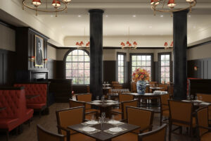 The concept of 3D
Three dimensions bring a third perspective to everything we see. In 3D, images will have width, depth and height. For many years, this technology was never harnessed but currently, the concept of 3D rendering has taken root. There is no doubt that this technology has generated a lot of appeal to most individuals and there are scientific considerations as to why this happens. After years of rigorous research, scientists found out a way to simulate the illusion of depth. The success was instant and volumes of even more baffling questions regarding the human mind and the appeal of images arose. The human brain seems to process images faster than it does any other material.
The research
In 2010, neurologists from John Hopkins University conducted research into what kind of reaction different images drew from different people. They used a series of variations of the same image and told test subjects who wore 3D glasses to look carefully and label the images they liked and the ones they did not. The results were tallied with a series of MRI scans obtained from previous test subjects. The conclusion was solid to the effect that human beings, no matter what era they live, are drawn irrevocably to images. The research revealed something else that was also interesting: human beings have a very similar perception of things that look good and those that do not, and this perception does not refer to mere abstract forms of renderings. It applies to images with angles and contours. The conclusions showed that a majority of the subjects leaned towards the ’soft side’. The rough edges made them 'withdraw’ from the kind of stimuli responsible for certain reactions. They showed a lot more affection to soft curves without jagged edges. Repeatedly, research has shown that human beings have a unique fascination when it comes to attractive visuals. In fact, it is a lot more ingrained than ever imagined.
How 3D visuals can influence purchase decisions
3D visuals can influence a perspective buyers decisions in a variety of ways. Color, shapes, lines, and texture being the most important.
Color
The concept of color looms large whenever concepts of design emerge. It is virtually impossible to argue for the case of 3D appeal without definitive aspects of color. Scientists have argued that individuals usually interpret events in forms of color sequences. Attractive colors rendered in 3D trigger positive emotions and therefore the desire to act decisively in terms of making purchases. The concept of color is connected to memory. This is because colors tend to take people back in time. Nicely done 3D graphics that emphasize on the lighter shades tend to pull people in on the action.
Shapes
To create the illusion of depth, shape needs to be in harmony with other elements. The human brain perceives different shapes and interprets them differently. As indicated from the Johns Hopkins research, subjects had a softer feel for designs that seemed nicely curved and lacking in jagged edges. 3D renderings are famous for their curvature and symmetry and could act as a motivator to buy. For the human mind, jagged or rough edges tend to show aggression and encourage negative reaction.
Lines and Texture
3D visuals tend to have 'a feel’. This tone is set by the buildup of different elements of graphics. 3D feels are soft as the usage of lines is cautious, which leads to softer designs. It is not known how, but studies show that people are generally happier and more in their zone when their surroundings have a look and feel of gentleness. In a setting like that, it is hard to imagine a customer not making a purchase. There is something mentally refreshing about the soft tones of nature laid down in 3D.
The statistics
Whether you are presenting your model to a prospective customer or a board for financing, investing in the visual presentation can make all of the difference. As an architect, if you could show a client or investor exactly what they are getting, they are much more likely to buy off on it. The reason visuals tend to be so powerful is that that they are gripping as well as memorable. Here is a statistic: 90% of the information that is transmitted to the brains is visual, rather than verbal or textual. In addition, the brain processes visuals 60,000 times faster than text. These statistics could be mind boggling, but they are also true. It is also common knowledge that generally, 40% of the population has a better response to appealing visuals as opposed to text. Finally, businesses that tend to use visuals in display and marketing grow 12% more than those that do not.
Visuals are the most powerful forms of communication and marketing. They get even better when they appear in 3 dimensions. Businesses that move forward always profess to the effectiveness of their visual angle as part of the reason for success. Experimenting with different renderings of 3D in different environments creates a lively atmosphere and lightens the moods of the customers. Since the appeal of images to man has never waned over the years, there is no reason to suggest that it ever will, and given the leaps made in perfecting 3D , there is no chance that it ever will at all. As someone who works in the business of designing spaces, this information will prove vital to your marketing campaign.
Marketing with the use of 3D Rendering
The art of marketing a product is simple; provide a simple yet effective way to communicate your product to your customer. This has been the philosophy of marketers for years as well as architects alike, communicating potential work through the use of 3D rendering
Using architectural 3D rendering creates an effective marketing tool giving a potential client a full visualization of the space or building. Architectural rendering also provides a comprehensive look at what to expect during the construction process and also the end result.
Here are some reasons why 3D rendering is an effective marketing strategy:
Virtual Representation – As stated before, photo realistic visualizations provide a clear and detailed representation of a building, banquet hall, hotel, or home. From how many windows the building will have, to the color of the paint, 3D architectural renders provide the optimal level of flexibility.
A View Through Multiple Angles – When looking to sell a potential property, there is nothing better than the ability to show the same building from a number of different angles. The average customer many times has a difficult time seeing the final product, by displaying the render from multiple angles you can help paint the full picture for the customer.
Cost Effective – Whither you decide to build a sample house or create scaled models, the cost can many times be expensive. 3D models are much less time consuming, cost effective, and economical.
Easy Changes and Edits – Once the project is finished, you have the ability to alter the image to your customers desires. This process can be easily done through the use of 3D rendering and presented back to the client for an immediate approval. 3D rendering guarantees that all aspects of the render are reviewed and up-to-date before the project goes on site.
3D renderings provide a number of crucial benefits for marketing and visual purposes that are truly unmatched. PiXate creative uses a number of sophisticated software tools to deliver the most photo realistic images to all of our customers and make their vision, a reality.
Transforming a 110 Unit Ski Lodge using 3D Rendering
Recently, we took on the task of transforming an architectural drawing of a 110 unit lodge into a photo-realistic image. The 3D render follows strict local, state, and federal regulations as well as a vision for future customers as to what this new 110-unit lodge would look like. The final 3D renders will also help Mount Snow obtain the final building approval and potentially entice prospective owners to invest in the project.
 Strategy:
PiXate creative uses 3D rendering to transform a collection of area photographs and architectural drawings into photo-realistic 3D renders. These high resolution images provide a number of crucial benefits to help move the project from the initial image phase to reality, as well as a key part of a multi-media presentations and marketing materials.
PiXate Creative worked with LineSync Architecture, a national architectural firm based in Vermont, on this particular project. LineSync's creative juices simmer up with the seamless integration of skills from Pixate and other talented Engineering Consultants adding their expertise to make large complex projects a pleasurable challenge
Tactics:
Our first step was to gather as many photographs as possible of the site. We felt some of the angles were missing, so we traveled to the location ourselves and took the photos we feel were necessary to advancing the 3D rendering process. We then obtained the drawings of the potential buildings and site plans from both the building and landscaping architects.

After obtaining the documents, we worked with noted International resort panners, SE Group to help provide some guidance as to where to properly place the building in relation to the landscape surrounding the building. We then created the most realistic, visually satisfying images of the potential buildings and site plans from both the building and landscaping architects.
Results:
Mount Snow’s Director of Planning, Laurie Newton, described PiXate Creative’s valuable contribution to the enhancement of the project as a whole. She explained that through the use of 3D Rendering, she was able to see the images be brought to life. When she saw the images for the first time she said, “Wow, that’s really cool. It looks like the buildings are already there! When we showed the renderings to other people and potential customers, they were also impressed. This has been very exciting for us and PiXate as well.”
 Laurie is very excited to work with PiXate Creative in designing and implementing the interior renderings for the building. She stated, “It’s very hard to look at a floor plan and get a visual picture of the inside. We’ll continue to use PiXate when beginning the sales phase their 3D interior renderings will give us a virtual walk through making it much easier to sell. Today’s customers expect it.”
How IKEA Effectively Navigated to 3D Rendering
IKEA, one of the world’s largest and most successful multinational companies, is known for providing some of the best high-quality, ready to build furniture in the world. The company's goal is to create visually appealing furniture that appeals to a wide array of customers.
After much deliberation, IKEA decided to make a drastic change the way they produced the images of the furniture. Prior to 2004, all of the pictures of furniture were done exclusively thorough photography. That all changed when Martin Enthed and his team took on the task of implementing 3D rendering to display their furniture.
“We made 8 or 10 quite bad product visualizations by today’s standards,” says Martin, “but it sparked something and we continued to work at it.” In 2006, the first catalogue featuring 3D renderings was made available displaying a chair known as “Bertil.”
Though photography is generally an  xcellent way to capture furniture, IKEA wanted to try something new that would enable the process to not only be faster, but much simpler and cheaper. With traditional photography, you need to have some sort of prototype available to shot, whereas 3D rendering you can map out the final product without having to use valuable resources and time.
The Change to 3D Rendering
When IKEA wanted to make the transition, they wanted to keep the same feel that had made their previous images so successful, the ability to make the environment feel “lived in.” This was the initial challenge that IKEA had to undertake, they wanted to use 3D rendering without their customers noticing any significant changes.
It was not an easy transition, with most of the photographers opposed to the idea of switching over to 3D rendering. IKEA initially started out with individuals who were willing to make the change and eventually recruited the skeptics of 3D rendering.
3D Rendering Techniques
According to IKEA, today 60-75% of all their images that show a single product are created using 3D rendering, with most being found on their website. The advantage of using 3D rendering is IKEA is able to not only show products individually, but combine them to build a 3D room set.
The reason for such a successful transition was the use of 3DStudio Max and V-Ray to create the 3D renders. IKEA is able to take advantage of this software by creating the most photo realistic images your without second guessing if the images are computer generated or not. V-ray also comes with a large amount of settings that enable you to tweak the values of the image to create a quality final product.
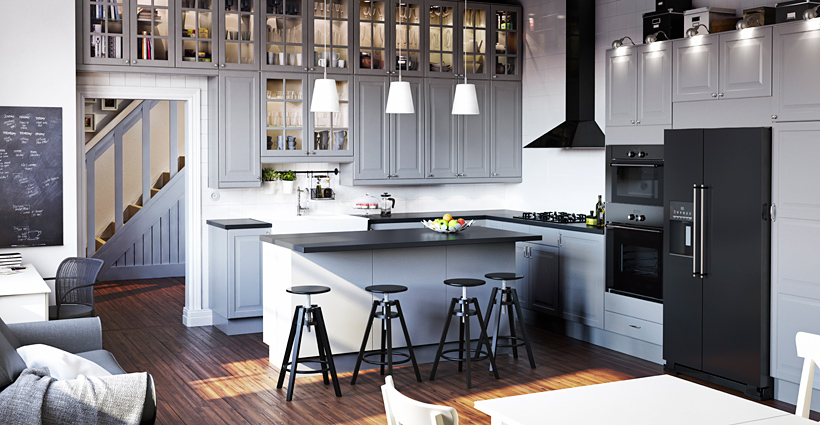 IKEA has taken these techniques and developed a standard for 3D rendering and furniture. This standard has enabled them to create the highest quality images that do not need to be altered for years to come. With technology moving at such rapid rates, creating a standard for furniture rendering is becoming harder for IKEA to maintain. That being said, by taking the time and energy necessary, IKEA will continue to create some of the most realistic 3D rendering for furniture for years to come.
All images provided by CG Society
PiXate Creative 3D Workflow Process: Step 4, Model Detailed Models
Have you ever heard the saying, “It’s hard to see the forest through the trees?” This saying pertains to 3D rendering as well as our company, PiXate Creative but for a different reason. Architectural rendering as a complete process is indeed time consuming and requires strict attention to detail.
The reason architectural rendering takes such good chunk of time is there is a number of drafts and details we go through to deliver a final product that will undoubtedly satisfy the customer. If we were to create the first draft and then send it off to the client, it would more than likely end up requiring a number of changes or a complete re-work.
A lot of clients have a design in their head, but have a hard to expressing what they are looking for. Our job is to work with them to get their vision on paper and make the image shine. In most cases there is some back and forth between us and the client. Not to worry though, PiXate Creative promises to take on the majority of the “heavy lifting” and get you the results you are looking for.
For this reason, we start off massing the space and adding details to the image as the image progresses. We find this to be a much more effective approach as we are able to pick up on details we would normally miss and refine the image according to the look and feel.
Since 2007, we have built an extensive library of 3D models that we have continually refined and edited. By having such an extensive library of renders at our disposal, a majority of our detailing work is usually added by simply dragging and dropping different aspects of the 3D render. The enables us to focus on creating high quality images at a much faster rate.
We also offer options for clients who prefer a more “hands off” approach throughout the entire 3d rendering process. We provide a finished image that is handled completely internally, making the work for the client as minimal as possible.
3D Interior Rendering
Commercial projects are a great place for our 3D rendering services. In a number of cases, businesses will spend a majority of their budget to ensure their space is visually appealing and organized.When walking into a building, a first impression is everything. From the décor of the building to how the look and feel appears, businesses want to impress their employees, vendors and most importantly clients and prospects.
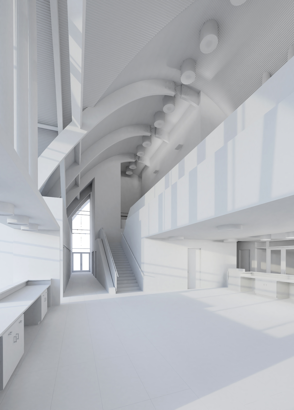
When designing a space to display to perspective clients, most individuals generally have a difficult time visualizing massing models or CAD elevations. To make the process easier, have the experts at PiXate Creative provide a 3D commercial interior render for your business. 3D commercial renders can be extremely powerful when you, the architect, have the ability to show your client actual furniture pieces with actual fabrics and textures applied to the model.
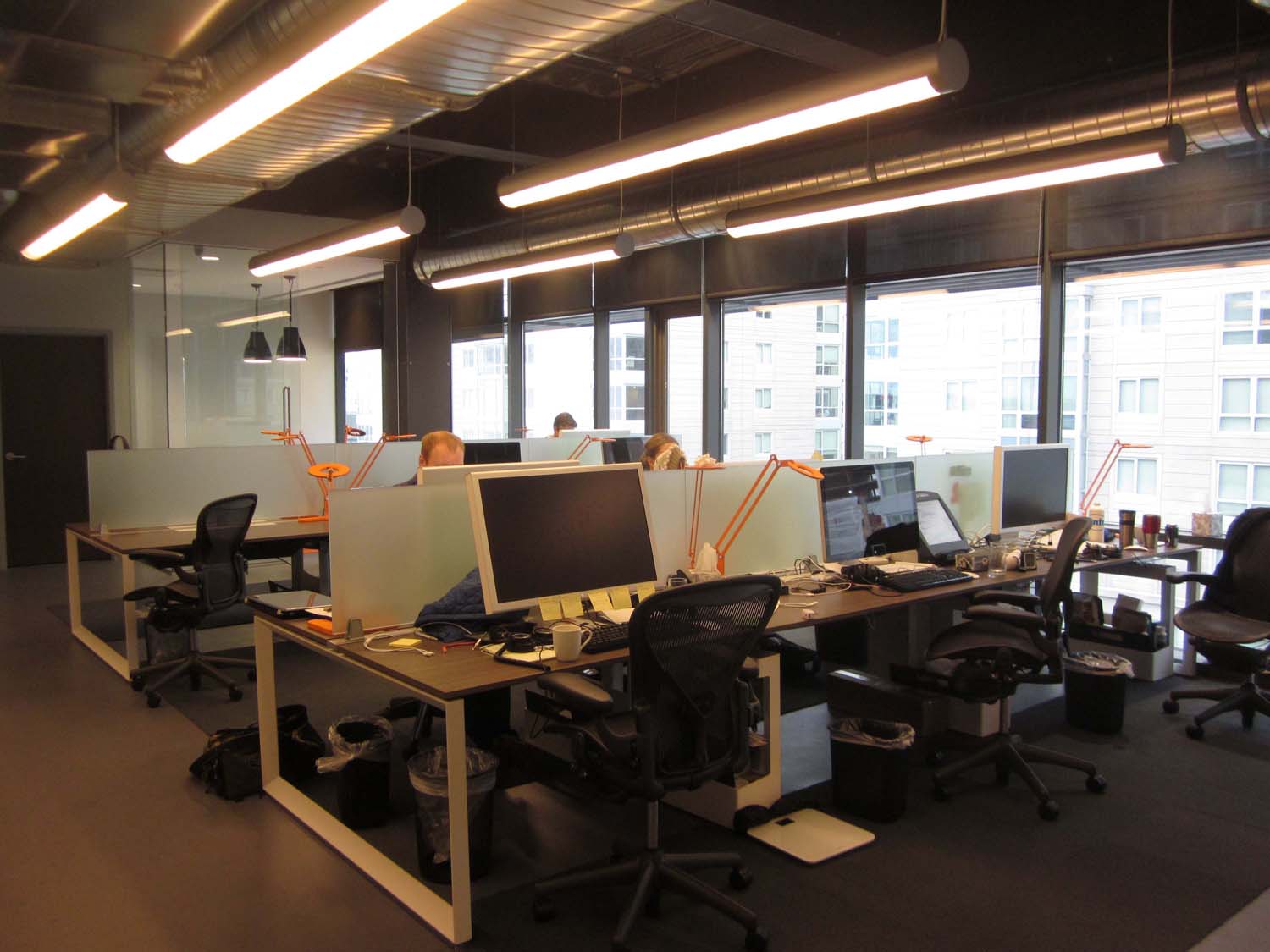
Here is an example of what a client of ours would send us:

If you have created a furniture plan for your business prior to our first meeting, have us put together a photo realistic 3D render for the interior of your building
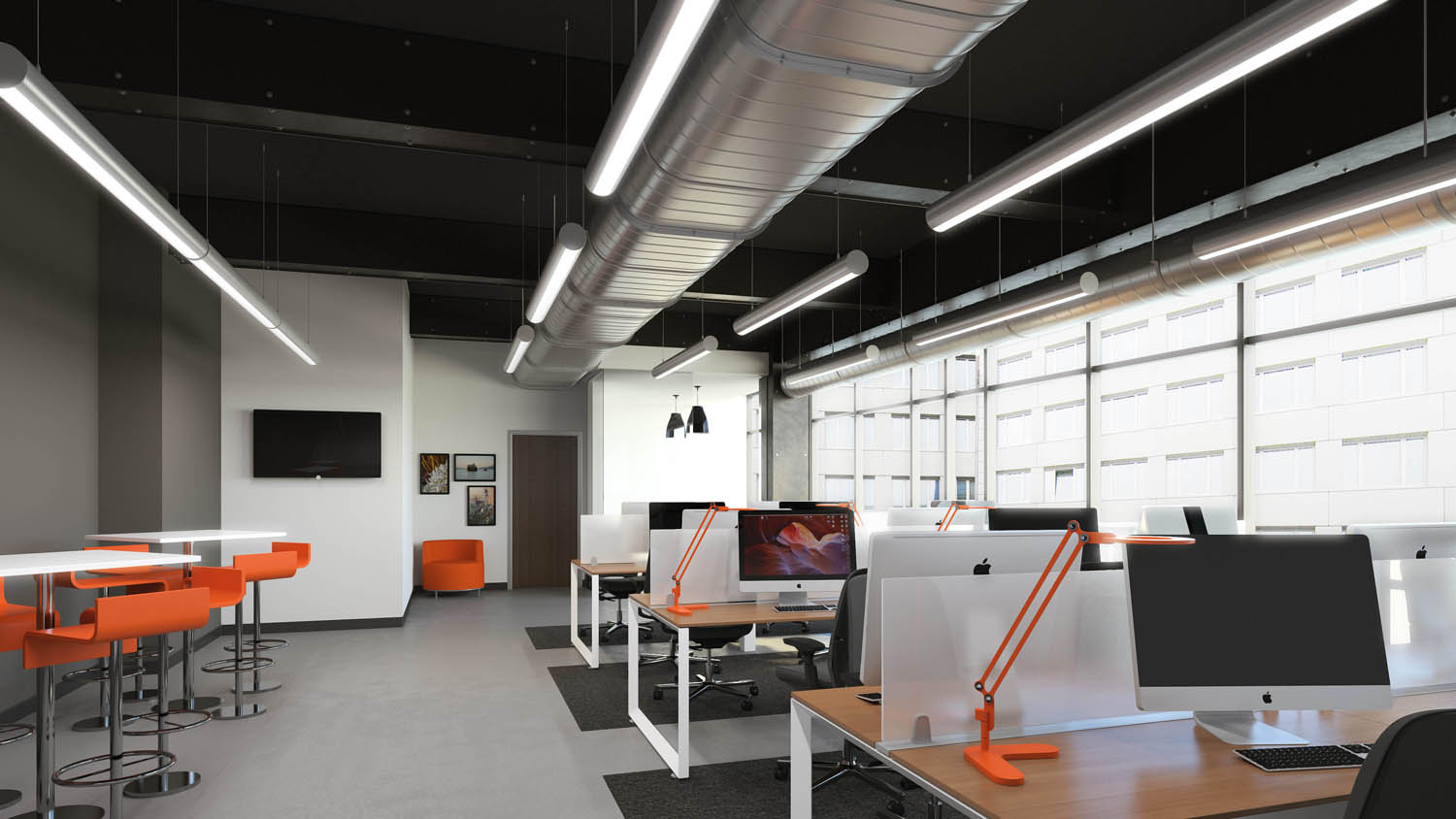
Using high quality 3D renders can give your architecture firm a leg up on the competition. These renders will position your firm as an expert capable of showing future clients how the space will look. With our years of experience in 3D rendering, we have started to build a catalog of 3D vs. actual spaces. Our clients are using these images in their presentations to attract future clients as well
Boston Rendering
An in Depth Look into a Boston Rendering
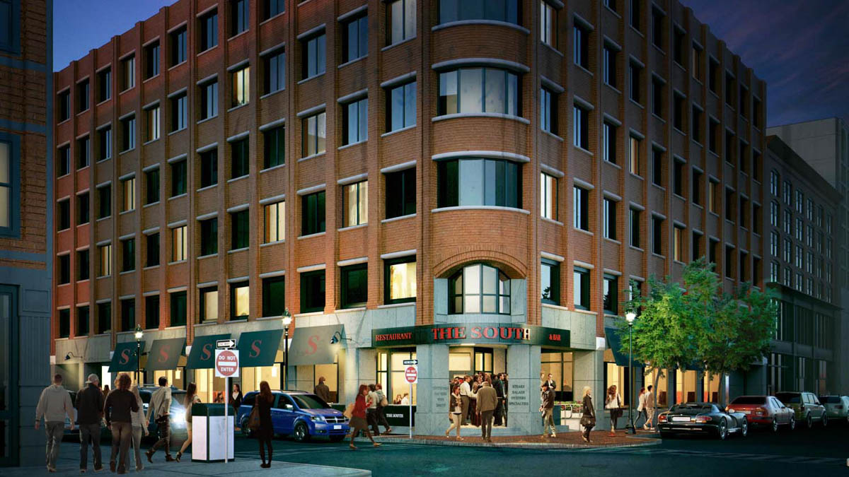
The attached image was created for Nelson, a global design, architectural firm, engineering, space planning and space management firm headquartered in Pennsylvania. Beacon Capital was the end user and they wished to have an image created which their Real Estate Professionals could use to generate excitement about the existing vacant retail space on the ground floor of 745 Atlantic. Our client came to us with a request. They needed an image created ASAP to show how the space might look but couldn't internally hit their deadline. They turned to PiXate Creative to pull off the render in a professional and efficient manner. Nelson, uses both Revit or SketchUp and in this project we received a SketchUp file.

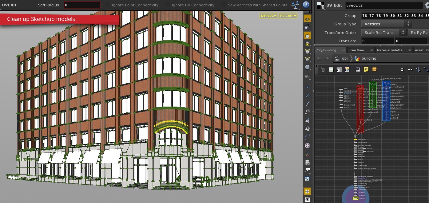
Step 1.
The first step of this process involved acquiring the SketchUp files provided by the client and moving them to the program Houdini. This enables us to provide our clients with a visual representation of the final product by creating the most realistic photo illustrations.
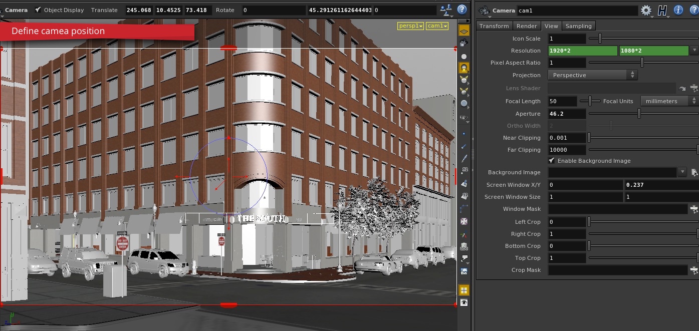
Step 2.
Defining the camera helps “paint a picture” for what the building will look like when it is finished. Since there was currently an existing building in place, our client asked us to improve the look of the building for marketing purposes.
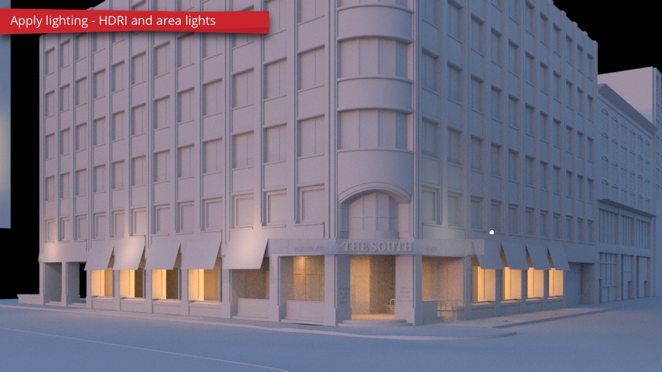
Step 3.
In this step we apply lighting to the image via HDRI. HDRI carries light information including the relationship between the location of the building and how the sun will hit the building.
Step 4.
Along with the actual 3D render of the building, we provide additional models to the scene to create a more realistic final product. With the additional models, it provides our clients with a clear and vivid picture of what their building will look like when it is actually constructed.

Step 5.
In this step you can see how we applied a number of materials and textures to make the image more realistic. From the lighting in the windows to the people walking around, we want to provide the most realistic 3D render we possibly can. By applying textures, you can see some of the finer details of the render as well such as the color of the building or the reflection of the glass. You can also see the discolorations on the brick giving the look of imperfection.

Step 6.
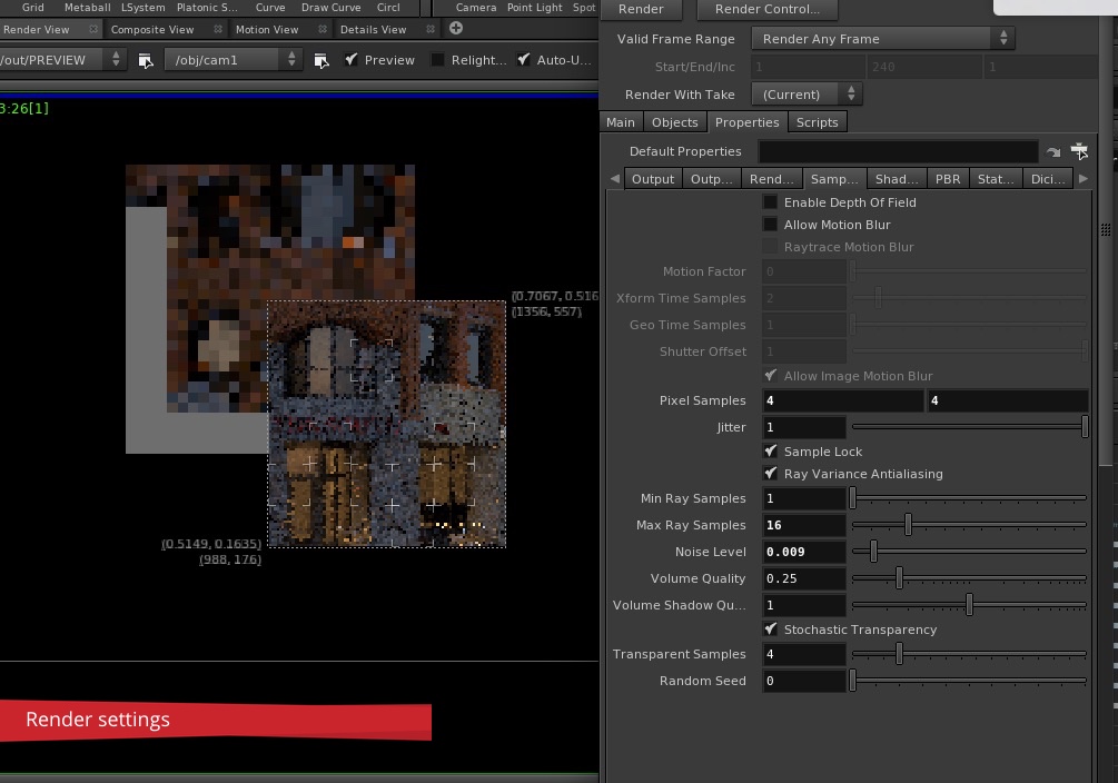
As you can in this step, we adjusted the render settings slightly enhance the quality of the image. This part of the process is rather complex due to the number of settings needed to make the image look great. If you are interested in hearing more about this step, send us an email to info@pixatecreative.com.
Step 7
The final portion of the process involves adding post process effects to the 3D render through either Photoshop or Nuke. Once this step is complete, the image is ready to be presented to the customer for final approval. As you can see the people were added to the post process and not rendered in the images. Sometimes we add people to the image during the 3D process; we will have a future blog discussing when to add people in 3D renders versus Photoshop, so keep a look out!

PiXate Creative 3D Workflow Process: Step 3, Refine Camera
The next step of the PiXate Creative 3D Workflow process involves refining the camera to fit the needs of the client. The purpose of this step is to help envision the space from multiple camera angles. This provides the client with a complete visualization of how the space will look and “feel” like.
We work with hand-in-hand with our clients to help create the best possible 3D render for their final vision. One problem we have noticed is the inability to fully visualize the space of the 3D render. By displaying the space through multiple angles, it gives us a chance to notice problems that may arise and fix the look and feel of each render.
Direction of the Light
When refining the camera angle on our 3D render the contrast, shadow, and texture play a large part not how the final image will appear. Furthermore, common problems such as high levels of exposure can be easily corrected with the proper use of exposure compensation.
Providing a Vision
Sometimes, visualizing the final product can be a difficult process especially if there is an empty plot of land. Here at PiXate Creative we bring yout building to life using a combination of the latest is 3D architectural technology and photography.
Research is Key
Before we begin to take pictures, from a small home to a skyscraper, we always preform extensive preliminary research and background research. We look for common focal points on each building that attract our customer’s attention. We use our combination of research and the focal points to generate the most realistic looking 3D render possible.
Choosing the Look and Feel
When choosing our images, we focus not only making our images more aesthetically pleasing but providing movement and dynamism to them as well. Our ultimate goal is to capture symmetry through the image and provide our client with the best possible visual representation of the building.
For more information of the entire PiXate Creative 8 step 3D workflow process, click here.
Drones for Civil Engineering and Architecture
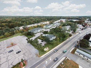
Using drones for civil engineering and architecture can be incredibility fun, but it can also be very helpful to move your projects through the approval stage as well. The modern drone with a camera practically flies its self, connecting to a GPS satellite and locking into place. In a recent project in Hampton, NH we took our drone for a spin! Here is our drone taking a picture of us, as we took a picture of it. That is me with the iPad.
 Drones can be extremely helpful for use in architectural visualizations. There are several reasons they are so effective.
- Not many people are using drones yet, so the pictures are unique. When something is unique, people pay attention to it. A unique image allows for you to grab people attention because it is something they are not used to seeing.
- It is much less expensive to use a drone than a helicopter. To rent a helicopter you are going to look at spending $3k – $5k or so just to get the helicopter in the sky.
- Drones can show you a the entire context of what is around.
- Ariel photos are much harder to recreate, so there can be more artistic license because the perspective can never be seen by the average person walking down the street.
- Not many people are using drones yet, so the pictures are unique. When something is unique, people pay attention to it. A unique image allows for you to grab people attention because it is something they are not used to seeing.
- It is much less expensive to use a drone than a helicopter. To rent a helicopter you are going to look at spending $3k – $5k or so just to get the helicopter in the sky.
- Drones can show you a the entire context of what is around.
cute phone casesphone caseyukon vape
- Ariel photos are much harder to recreate, so there can be more artistic license because the perspective can never be seen by the average person walking down the street.
 There is a common theme around architectural renders. The general population has a very hard time picturing how projects will look when they are complete. Control the narrative and show people who it will look. You will be rewarded by having your projects go more smoothly. Drones can be a really powerful tool in your arsenal, so make sure and develop some relationships with companies that have them, or pick one up and learn to fly it. We will show you a really good build in a future post, or you can email me at jkutyla@pixatecreative.com and we would be glad to share our setup with you.


