Boston Rendering
An in Depth Look into a Boston Rendering
The attached image was created for Nelson, a global design, architectural firm, engineering, space planning and space management firm headquartered in Pennsylvania. Beacon Capital was the end user and they wished to have an image created which their Real Estate Professionals could use to generate excitement about the existing vacant retail space on the ground floor of 745 Atlantic. Our client came to us with a request. They needed an image created ASAP to show how the space might look but couldn't internally hit their deadline. They turned to PiXate Creative to pull off the render in a professional and efficient manner. Nelson, uses both Revit or SketchUp and in this project we received a SketchUp file.

Step 1.
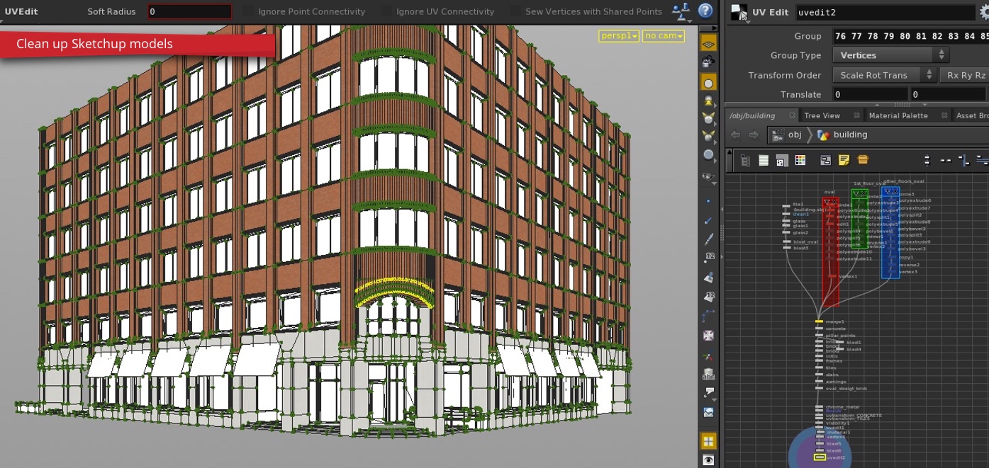
The first step of this process involved acquiring the SketchUp files provided by the client and moving them to the program Houdini. This enables us to provide our clients with a visual representation of the final product by creating the most realistic photo illustrations.
Step 2.
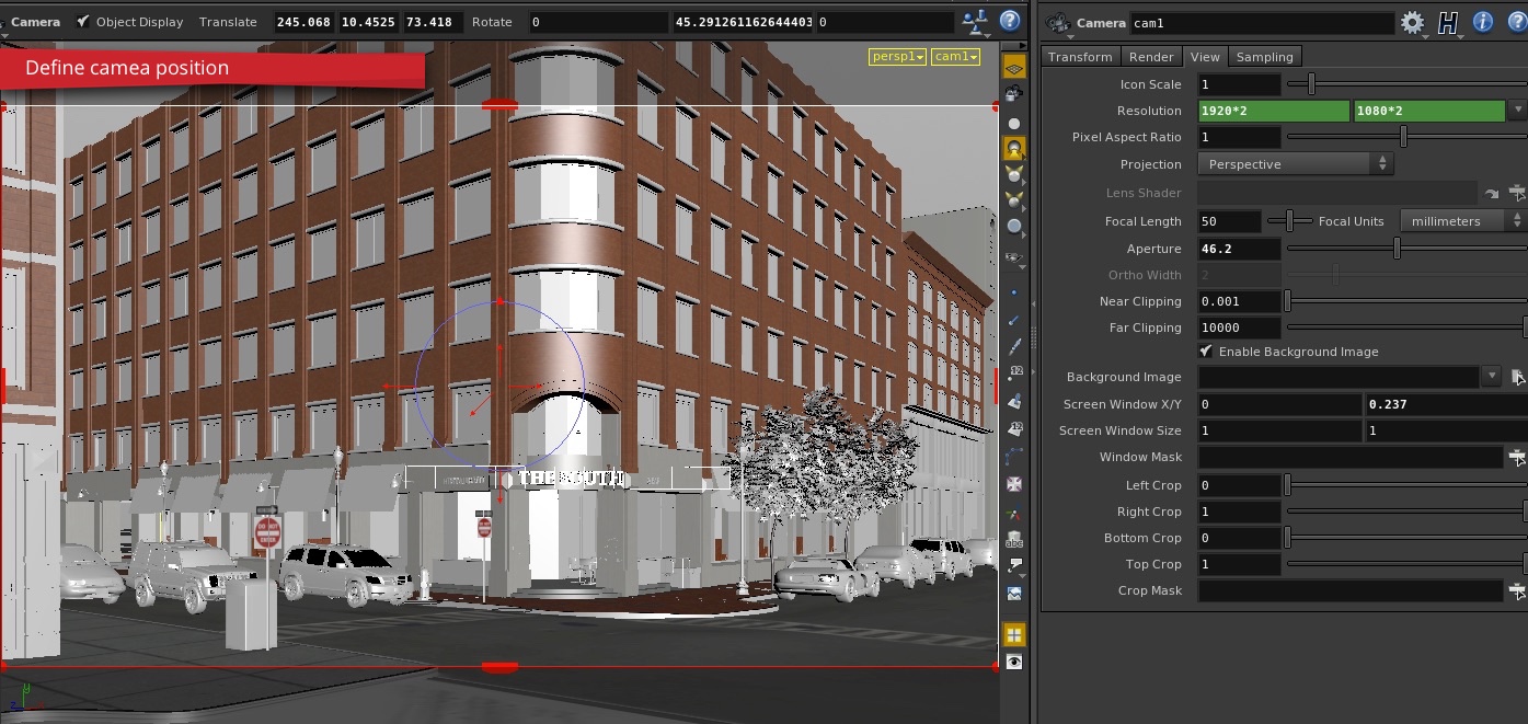
Defining the camera helps “paint a picture” for what the building will look like when it is finished. Since there was currently an existing building in place, our client asked us to improve the look of the building for marketing purposes.
Step 3.
In this step we apply lighting to the image via HDRI. HDRI carries light information including the relationship between the location of the building and how the sun will hit the building.

Step 4.
Along with the actual 3D render of the building, we provide additional models to the scene to create a more realistic final product. With the additional models, it provides our clients with a clear and vivid picture of what their building will look like when it is actually constructed.

Step 5.
In this step you can see how we applied a number of materials and textures to make the image more realistic. From the lighting in the windows to the people walking around, we want to provide the most realistic 3D render we possibly can. By applying textures, you can see some of the finer details of the render as well such as the color of the building or the reflection of the glass. You can also see the discolorations on the brick giving the look of imperfection.

Step 6.
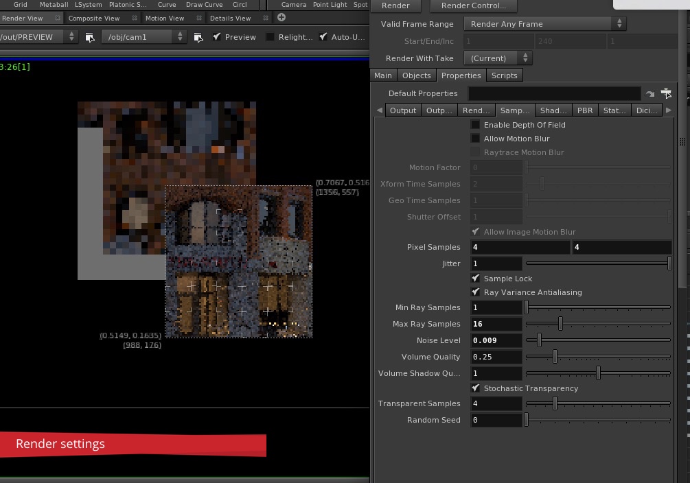
As you can in this step, we adjusted the render settings slightly enhance the quality of the image. This part of the process is rather complex due to the number of settings needed to make the image look great. If you are interested in hearing more about this step, send us an email to info@pixatecreative.com.
Step 7
The final portion of the process involves adding post process effects to the 3D render through either Photoshop or Nuke. Once this step is complete, the image is ready to be presented to the customer for final approval. As you can see the people were added to the post process and not rendered in the images. Sometimes we add people to the image during the 3D process; we will have a future blog discussing when to add people in 3D renders versus Photoshop, so keep a look out!

PiXate Creative 3D Workflow Process: Step 3, Refine Camera
The next step of the PiXate Creative 3D Workflow process involves refining the camera to fit the needs of the client. The purpose of this step is to help envision the space from multiple camera angles. This provides the client with a complete visualization of how the space will look and “feel” like.
We work with hand-in-hand with our clients to help create the best possible 3D render for their final vision. One problem we have noticed is the inability to fully visualize the space of the 3D render. By displaying the space through multiple angles, it gives us a chance to notice problems that may arise and fix the look and feel of each render.
Direction of the Light
When refining the camera angle on our 3D render the contrast, shadow, and texture play a large part not how the final image will appear. Furthermore, common problems such as high levels of exposure can be easily corrected with the proper use of exposure compensation.
Providing a Vision
Sometimes, visualizing the final product can be a difficult process especially if there is an empty plot of land. Here at PiXate Creative we bring yout building to life using a combination of the latest is 3D architectural technology and photography.
Research is Key
Before we begin to take pictures, from a small home to a skyscraper, we always preform extensive preliminary research and background research. We look for common focal points on each building that attract our customer’s attention. We use our combination of research and the focal points to generate the most realistic looking 3D render possible.
Choosing the Look and Feel
When choosing our images, we focus not only making our images more aesthetically pleasing but providing movement and dynamism to them as well. Our ultimate goal is to capture symmetry through the image and provide our client with the best possible visual representation of the building.
For more information of the entire PiXate Creative 8 step 3D workflow process, click here.
Drones for Civil Engineering and Architecture
Using drones for civil engineering and architecture can be incredibility fun, but it can also be very helpful to move your projects through the approval stage as well. The modern drone with a camera practically flies its self, connecting to a GPS satellite and locking into place. In a recent project in Hampton, NH we took our drone for a spin! Here is our drone taking a picture of us, as we took a picture of it. That is me with the iPad.
 Drones can be extremely helpful for use in architectural visualizations. There are several reasons they are so effective.
- Not many people are using drones yet, so the pictures are unique. When something is unique, people pay attention to it. A unique image allows for you to grab people attention because it is something they are not used to seeing.
- It is much less expensive to use a drone than a helicopter. To rent a helicopter you are going to look at spending $3k – $5k or so just to get the helicopter in the sky.
- Drones can show you a the entire context of what is around.
- Ariel photos are much harder to recreate, so there can be more artistic license because the perspective can never be seen by the average person walking down the street.
- Not many people are using drones yet, so the pictures are unique. When something is unique, people pay attention to it. A unique image allows for you to grab people attention because it is something they are not used to seeing.
- It is much less expensive to use a drone than a helicopter. To rent a helicopter you are going to look at spending $3k – $5k or so just to get the helicopter in the sky.
- Drones can show you a the entire context of what is around.
cute phone casesphone caseyukon vape
- Ariel photos are much harder to recreate, so there can be more artistic license because the perspective can never be seen by the average person walking down the street.

 There is a common theme around architectural renders. The general population has a very hard time picturing how projects will look when they are complete. Control the narrative and show people who it will look. You will be rewarded by having your projects go more smoothly. Drones can be a really powerful tool in your arsenal, so make sure and develop some relationships with companies that have them, or pick one up and learn to fly it. We will show you a really good build in a future post, or you can email me at jkutyla@pixatecreative.com and we would be glad to share our setup with you.
Pixate Creative 3D Workflow Process: Step 2, General Massing
General Massing in architecture refers to the overall shape and size of the building. Most Architectural styles are usually defined by the use of massing, but, some focus on other aspects of the building taking away from the massing process.
If a buildings massing is not proportional, no amount of extravagant details will compensate for the lack of proportion. Massing gives the building form, providing an emotional connection with the individual.
General massing provides an excellent way for the client to understand the overall space of a building. It gives our clients the best possible perspective of the building and provides them with visual representation of the final product.
Here at PiXate Creative, we work with our clients to provide the best possible results with the use of massing as the foundation. For more information on our 3D workflow process, contact us today at 603.899.7495!
The Rule of Thirds... Why is it so Important for 3D Architecture?
One of the most well-known concepts of both 3D architecture and photography in general is the “Rule of Thirds”. The Rule of Thirds is one of the most basic foundations necessary to create an image that is both well balanced and symmetric.
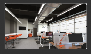
The basic premise behind the Rule of Thirds is to imagine an image that is broken down into thirds both horizontally and vertically for a total of 9 equal parts. The rule of thirds discourages the simple notion of placing an image in the middle and enables you to align the subject along one of the horizontal or vertical guidelines.
These guidelines display important sections of your image, known as points of interest, and enable you to readjust your image accordingly. If your image is placed at one of the points of interest, it creates a more balanced look allowing the viewer to see the image more naturally.
It has been proven that people’s eyes tend to drift towards these intersection points naturally rather than the center of the image, so, using the Rule of Thirds works as the most natural way of viewing an image.
Pixate Creative 3D Workflow Process: Step 1, Gather Resources
PiXate Creative provides our clientele with a number of comprehensive illustration strategies coupled with our attention to detail and workmanship. The first of our 8 step program involves gathering the necessary references needed to begin the initial process. We work personally with our clients to create photo-realistic illustrations using the only the latest in 3D workflow technologies.
- AutoCAD files: AutoCAD is a commercial software application for both 2D and 3D design, used to help develop, design, and draft for your specific project at hand. It provides a visual representation of the project and gives you an idea of what the final product will look like.
- Revit: This tool is used by architects and allows them to design the structure and various components in 3D, edit the model with 2D elements, as well as other important structural information.
- Archicad files: This is architectural software that helps handle all aspects of the look and feel of the entire design process, from the interior of the building to the exterior.
- SketchUp: SketchUp is a 3D modeling program commonly used for architectural work. This program works by enabling us to draw in 3D and create realistic looking models to help our clients visualize the final product.
- AutoCAD files: AutoCAD is a commercial software application for both 2D and 3D design, used to help develop, design, and draft for your specific project at hand. It provides a visual representation of the project and gives you an idea of what the final product will look like.
AutoCAD files:
- Revit: This tool is used by architects and allows them to design the structure and various components in 3D, edit the model with 2D elements, as well as other important structural information.
Revit:
- Archicad files: This is architectural software that helps handle all aspects of the look and feel of the entire design process, from the interior of the building to the exterior.
Archicad files:
- SketchUp: SketchUp is a 3D modeling program commonly used for architectural work. This program works by enabling us to draw in 3D and create realistic looking models to help our clients visualize the final product.
SketchUp:
What is Responsive Design?
Responsive Design: Mobile ‘Magic’
If you’re not browsing the web using mobile devices such as smart phones and tablets, you quickly are becoming the minority. Sure, most people today browse websites from their desktops. But that’s changing, and the changes are, well, everywhere. Internet browsing using mobile devices has more than doubled in the past two years. Give it another year and it just may surpass browsing via the desktop. Still, the user experience today is not a memorable one. The screen often is a blur or is otherwise difficult to read. Until now, the response has been to spend time and money creating an ever-growing number of websites designed for different screen sizes. Admirable, but, most agree, eventually impractical. PiXate Creative is among those who have a better way. It has developed a responsive website that will arrange the website elements to fit any screen naturally. The technology is called Responsive Design.
Responsive Design detects a visitor’s screen size and changes the layout to fit the screen of the device he or she is using. And it doesn’t apply only to small screens. Larger screens can take advantage of this technology, too. Globally, people are accessing the web via their smartphones more often than ever.
A study by Google and Ipsos, a global market research company, focused on how consumers use their smartphones. “Smartphone ownership has jumped globally, increasing 11 percent to 44 percent of the total population in Spain and by 7 percent to 38 percent of the total population in the U.S.” says Jason Spero, Head of Global Mobile for Google.
The study also showed smartphone owners are not just browsing the web; they’re taking action. Of the 92 percent of U.S. smartphone users who seek local information, 89 percent of these take action such as calling a store or visiting a business.
Inside the Buyer’s Brain: A Book Review
Inside the Buyer’s Brain: A Book Review
Hinge, a marketing firm focusing on the professional services industry, has developed a reputation for producing thought-provoking marketing books based on their own research. So when we got the news that their new book, Inside the Buyer’s Brain, was available, we were excited to give it a read. Here’s what to expect:
Overview
Book: Inside the Buyer’s Brain: How to Turn Buyers into Believers
Authors: Lee W, Frederiksen, Ph.D., Elizabeth Harr, Sylvia Montgomery, CPSM, and Aaron E. Taylor
Published by: Hinge Research Institute
Best for: B2B firms, professional services companies, marketing firms
Summary: In their latest book, the Hinge team focuses on the relationship between buyers and sellers of professional services, helping sellers identify where the gaps lie and how they can close more business. Hinge based the book on interviews with over 1,300 buyers and sellers of professional services.
What I liked
- Research
It’s obvious that research is at the heart of this book, and the Hinge team makes the data easy to understand with lots of graphs, charts, and infographics.
- Readability
Hinge has a knack for taking a topic that could easily be dry or academic and making it fun and readable. Inside the Buyer’s Brain uses the same light, sometimes irreverent tone that made their other books so popular, while not skimping on the hard facts. Interspersing the written content with lists, infographics, and case studies, the writers do a good job keeping the reader interested and making it easy to digest the information. One of my favorites: at the end of each chapter, there is a box summarizing the “Key Takeaways”—nuggets of wisdom that you can walk away with.
- Visuals
Inside the Buyer’s Brain offers visually compelling graphics that make the book fun to read. Along with colorful graphs and charts, Hinge has added alluring, eye-catching pictures that demonstrate the skill of their graphic design team.
What I learned
- 1. Sellers truly do not understand their buyers!
I knew that there would probably be a perception gap between buyers and sellers on certain issues. But I had no idea it would be so large! For example, for one part of their survey, Hinge asked buyers to state their top business challenges. Then sellers were asked the same question. In all categories except technology, sellers badly underestimated buyers’ most important business challenges.
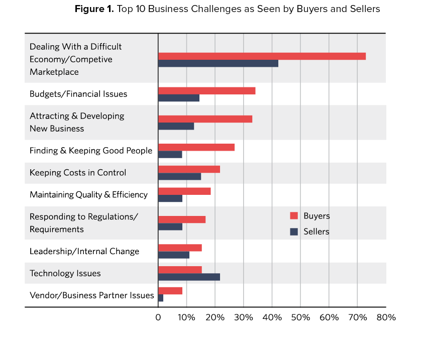
Hinge highlighted a problem: sellers misunderstand buyers’ needs. This underlying problem has profound implications for many other aspects of a firm’s business, including creating relevant service offerings, communicating value to prospects and clients, and expanding relationships with current clients.
2.Most professional services firms are not well known
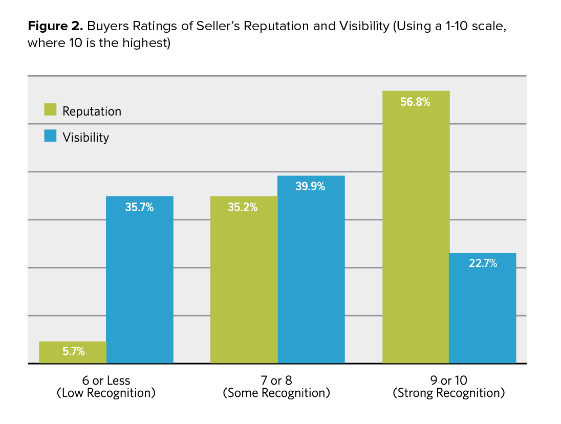
Hinge’s research demonstrates that, while many firms offer quality services that tend to bring back repeat clients, the firms are not well known outside their circle of clients. The chart below illustrates this problem: while nearly 60% of all buyers gave their vendors high marks for reputation, only about 23% of buyers thought that their vendors were well known. The Hinge team shows how this gap presents a huge opportunity for firms to move ahead of the competition by clearly demonstrating their value and message, and then goes on to offer techniques for making that happen.
- 3. Winning firms do things differently
One of the most interesting takeaways from the book is a comparison, on page 66, between the behaviors of winning firms (those firms that successfully closed the deal) and runner-up firms (those firms that almost closed the deal but then ended up not getting chosen). For example, winning firms ranked a certain behavior—educating prospects with new ideas or perspectives—very high in their process of attracting new business, while runner-up firms ranked that same behavior low on their list of priorities. Hinge ties it all together with a neat infographic, and offers strategies for changing your marketing model.
There are plenty more golden nuggets of knowledge in this book, but it’s impossible to cover all of it in a single book review. As Hinge says, “if you are a professional services firm executive interested in growing your business, entering new markets, or introducing a new service, you need to get inside the minds of your clients and look at your firm from their perspective.” If you fit that category, Inside the Buyer’s Brain should be recommended reading.
When is the Right Time to Redesign a Website?
By Katie Sanner
Redesigning a website is a big undertaking. And as your brand’s window to the world, you want to make sure it is visually compelling, user-friendly, and built with the capability to capture leads online. Our research found that 80% of high growth AEC firms redesigned their website within the past year, compared to just 40% of average growth firms. If your firm’s goal is to be on the fast-track for growth, it might be time to think about redesigning your website.
Many firms in the AEC industry will say that the design and look of a website is the most important thing to consider when looking to redesign. Wrong. You need to take a look at the big picture and think about making your website work to meet your business objectives. The most successful AEC firms are redesigning their website into lead generating websites. Nearly 80% of high growth AEC firms claim online contact forms to be the #1 way leads contact them. Taking advantage of online lead generation with offers to prospects and fresh content is absolutely vital to not only your strategy behind redesigning your website, but also your firm’s growth strategy.
Content Marketing Drives Inbound Leads
Redesigning your website goes beyond just the look and feel – incorporating a content marketing strategy is also an important element. Content marketing is a central part of every lead generating website as, many times, it is content that brings people to your site. Think about those in the early stages of the buying process. These folks search online to find the answers to their questions, and your content will be there to educate.
Nearly 60% of high growth AEC firms update their website on a weekly basis to keep people coming back. For many, this means producing a blog that will keep your website and content fresh, continually offering more to visitors. Once on your website, you have the opportunity to offer users a good experience and more educational content. A longer, more substantial piece of content means that a visitor might be willing to exchange their email address in order to download. This will enable you to build up a list of emails to market to.
As your firm focuses on producing consistent and educational content marketed to your email list, your prospects will return back to your website allowing them to get familiar with your brand, until they are ready to work with you.
You Can’t Forget Social
You’ve now got a new lead generating website and a content strategy on your plate, but in order to do those successfully, you need to have a social media strategy in place as well. Social media can help you reach out to your target audience and showcase projects that your firm is working on. Social channels also give you the perfect platform to promote your content to new viewers, who will then be enticed to visit your website. And once on your website, they enter that lead generating funnel.
SEO’s Importance
The last element – we promise – to redesigning your firm’s website is search engine optimization (SEO). In order for people to find your website, you need to appear in search engine results. This means optimizing website pages and your content for specific keywords that your audience will be searching for. Nearly all research online begins with a search engine – so this is not a piece to forget.
If you complete all of these steps, congratulations! You now have a powerful online marketing strategy. You may have thought that all you needed was a new look and feel to your website, but in today’s changing market for AEC firms, it is critical to have a solid digital brand presence.
There are lots of great resources out there to help you along this process, I would recommend reading Hinge’s Lead Generating Website Guide to start. Now stop thinking about it and start making your website work for you by bringing in leads online.
About the Author:
Katie Sanner, Associate Account Director at Hinge. Combining Katie’s design, advertising and marketing experience, she is able to consistently assist her clients in brand building, improve their brand strength, and increase marketability. Prior to working at Hinge, Katie was a marketer for a Washington DC Top 25 Engineering Firm, Gordon and the Creative Manager for a nationally renowned advertising agency, Arnold Worldwide. Katie is an active member of the Society of Marketing Professional Services where she currently sits on the DC Chapter’s Board of Directors.
The ROI of Outsourcing Architectural Rendering
 For many types of businesses, keeping architectural rendering services in house is the less attractive of two options. While there might at first appear to be a built in advantage to keep some level of 3D design staff in house, for the most part outsourcing these functions produces a significant cost savings. For companies where the core function is not 3D rendering, outsourcing architectural rendering services is an exceptionally viable cost cutting measure.
Examples of the need for architectural rendering services abound. Considering that GE is intentionally known for having "Imagination at Work," this space had to be special and reflect this branding image as clearly as possible. The relative costs of outsourcing architectural rendering services versus hiring an in house architect were dramatically different from one another.
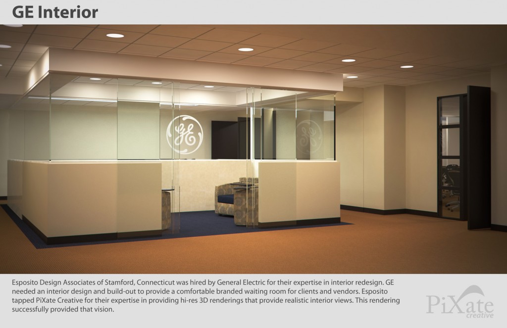
This was not a mere interior decorating job that could have been given to nearly anyone with a reasonable eye for detail. This required a substantial amount of custom installations. These included GE branded glass etchings, chairs with retracting desks to facilitate laptop use and writing and full coordination of every detail in the room's overall decor. From the wall and floor colors all the way to the trim and the lighting fixtures, GE's waiting room required a deep level of design skill. Obviously, an investment of this caliber required a 3D rendering for those in charge to review before the various components could be ordered.
For example, according to the Bureau of Labor Statistics, the average income level for an architect in the Stamford, CT area is $114,230 per year. This figure only considers base salary, not considering any bonuses a successful architect might earn. As well, this figure does not consider other perks, such as the average of three weeks per year of vacation time that an architect receives as part of overall compensation. As well, a highly detailed 3D drawing by an architect can run $1,500-$2,000 and take a day or more. All of these factors contribute to a reasonably large and repeating cost center.
However, to outsource the need for architectural rendering services to an outside company can largely eliminate these costs. While there are some companies that require a full time designer of this nature, and can thus justify the overall costs associated with keeping someone on the payroll, most companies can save a rather large amount of overhead by outsourcing this portion of their service offering. In almost every case, the individual or company they outsource to will be equally competent. The primary difference will be an overall greater level of flexibility offered by outsourcing this portion of the design process versus keeping it in house.
Flexibility is a key component of maintaining the largest margins possible. When a project is on the horizon that requires architectural rendering services, hiring an outside company to handle this aspect of the job can be an excellent way for a company to keep focused on its core offering. When there is no need for such a service, such as during times rich with different kinds of projects, having a leaner payroll enriches other, more core operations.
Hiring a rendering company for architectural rendering services is a good idea when this operation is not a core component of the business that needs such work performed. Construction companies and companies with other kinds of focuses can maintain higher profit margins and trim costs dramatically through outsourcing such designing operations to outside companies. To see our portfolio of our work click here.


